
Singapore Night Festival
"Imaging a visual system that ties the festival together across print, space and screen."
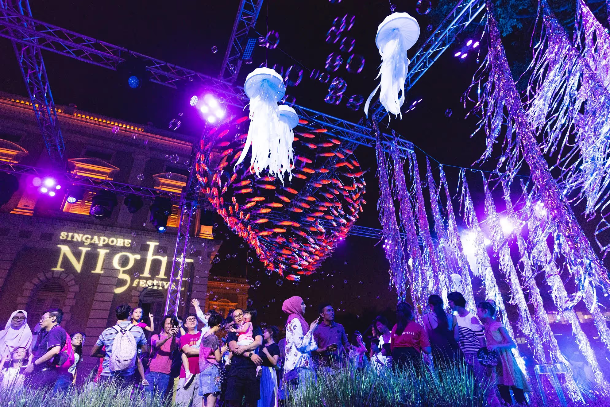
Singapore Night Festival returned with its 13th edition theme, Rebirth, reflecting Singapore’s post-pandemic recovery. The campaign needed a refreshed look that could carry a strong night-time atmosphere across both physical and digital touchpoints.
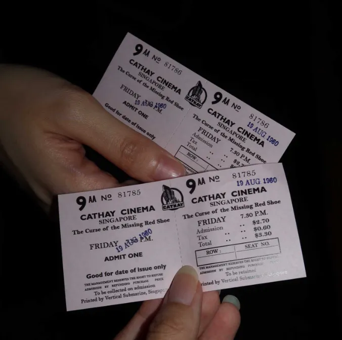
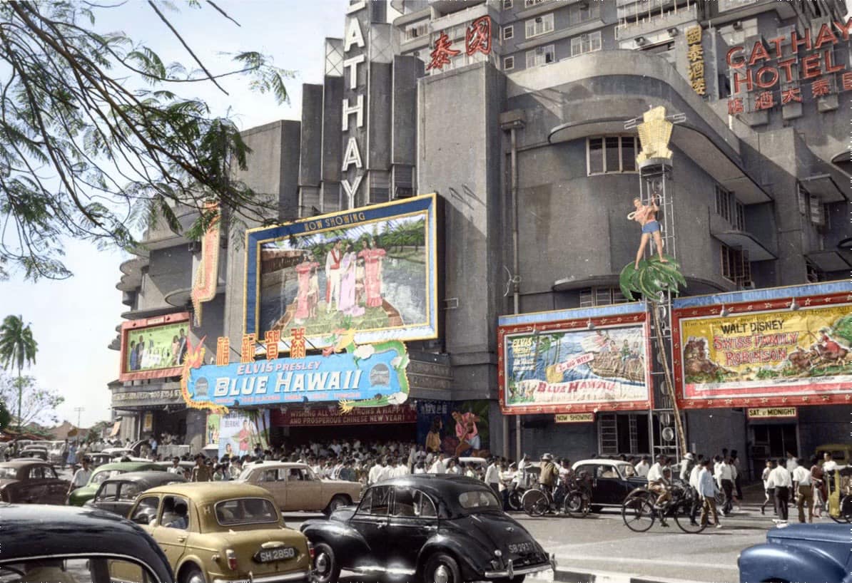
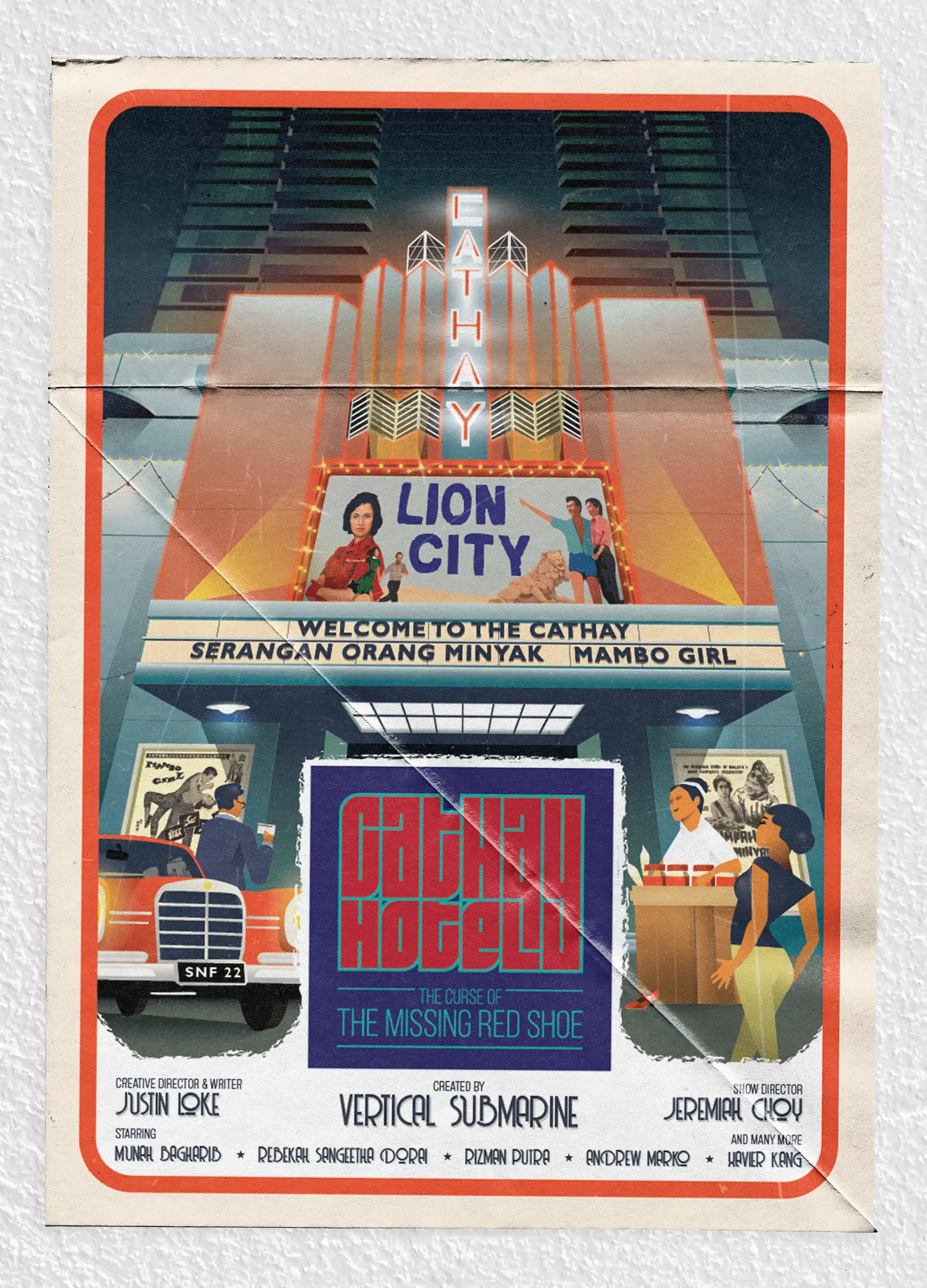
Engaged directly to develop the festival’s main key visual and it’s headline act visual, Cathay Hotel: The Curse of the Missing Red Shoe, as one cohesive system. The visuals had to scale cleanly across prints, placemaking and social/web while staying instantly recognisable.
Clients
National Heritage Board
Pico Art Agency
Scope
Pitching
Art Direction
Visual System
Print Design
Illustration
Date
2022
Stylescape pitching
Several stylescapes were explored to test tone, motifs and colour, each paired with quick mock applications - print, digital and environmental. This made it easier for stakeholders to compare options and align on a direction early.
Stylescape pitches

Key Visual
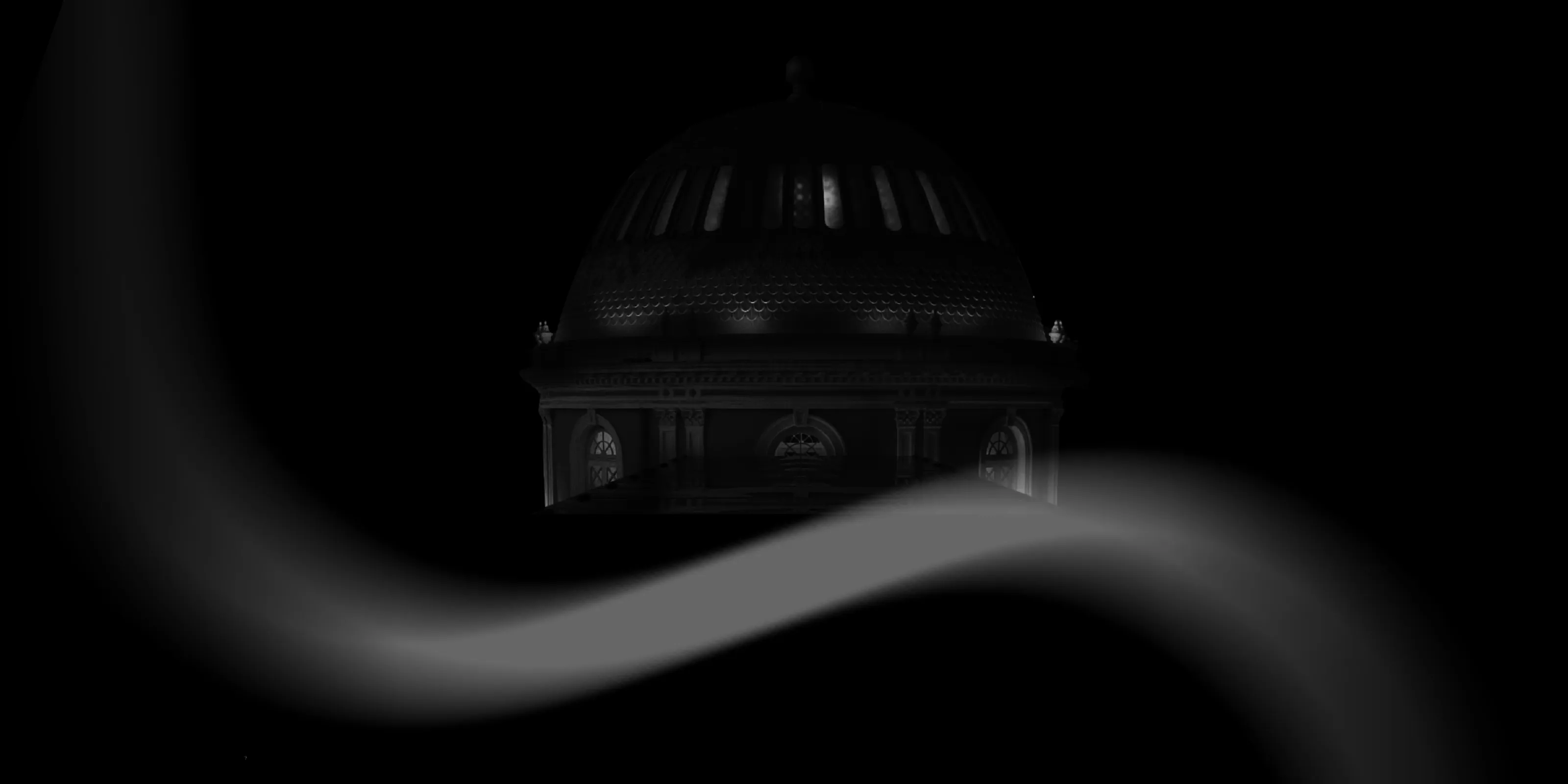
“Sound as a wave, smell as a particle, and light as both a wave and a particle.”
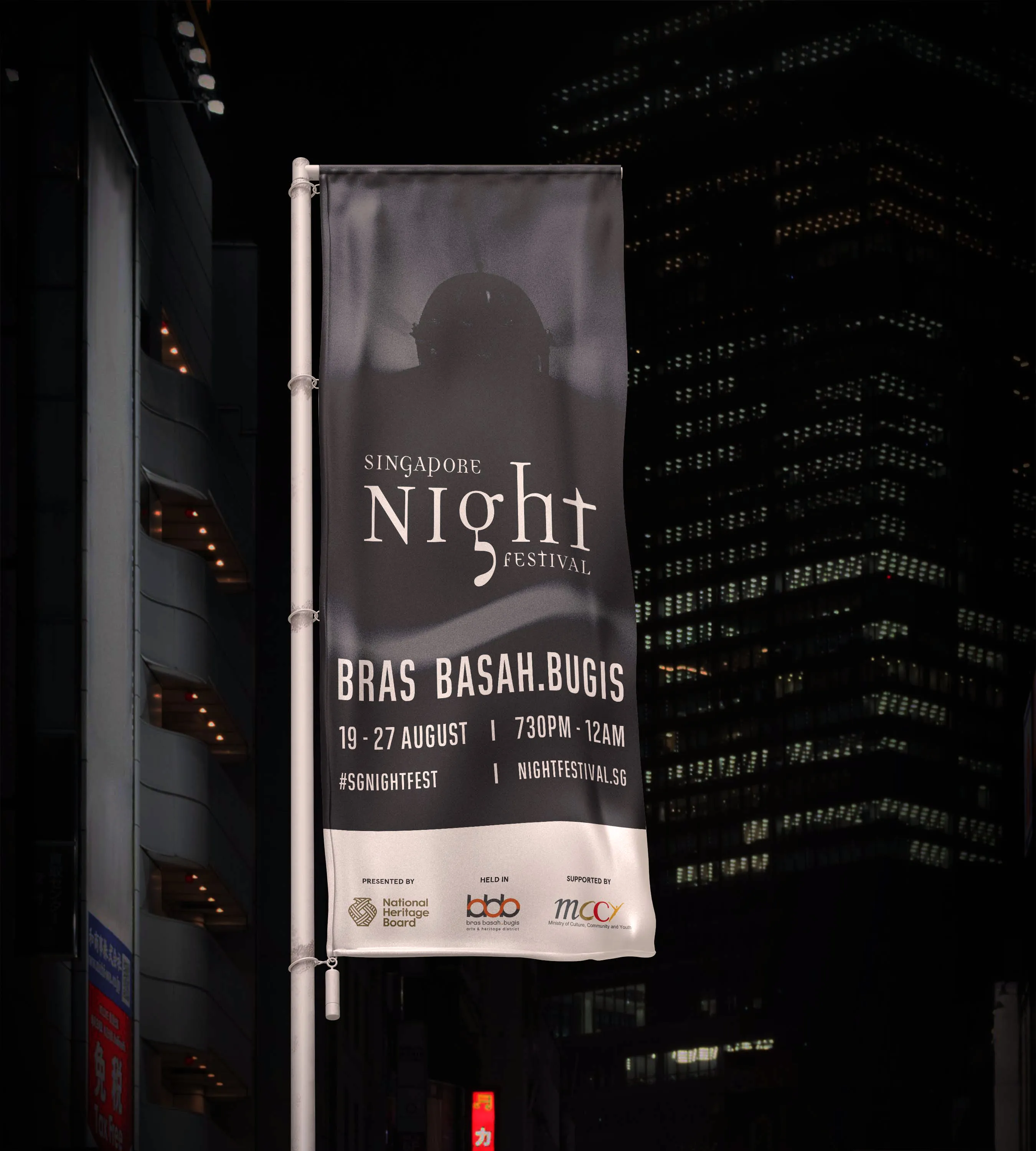
The theme was translated into a clear visual idea: light, sound and scent represented as waves and particles. This created a flexible motif that stayed consistent across formats, while a restrained base palette left room for the programme highlights to stand out.
Key Visual
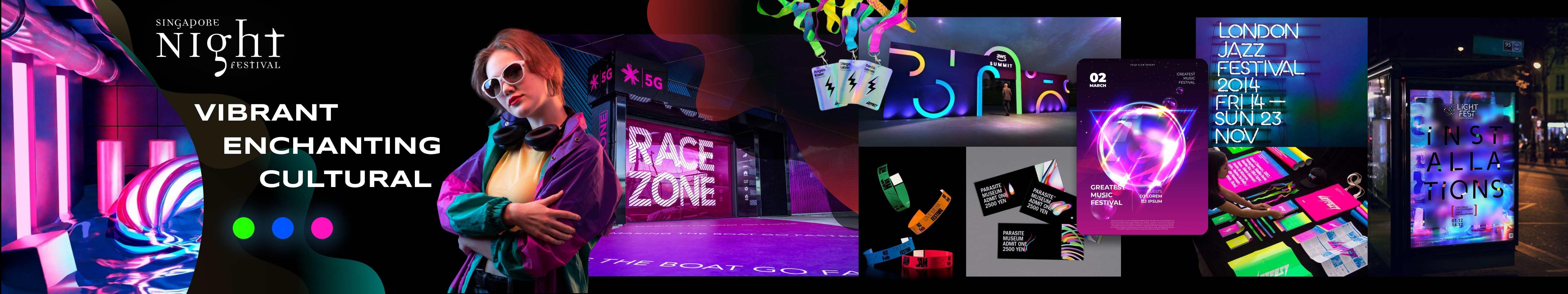
Outcome
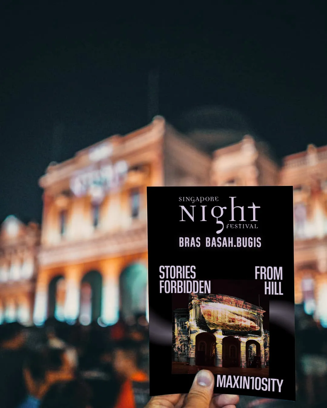
Programme Guide
Street post
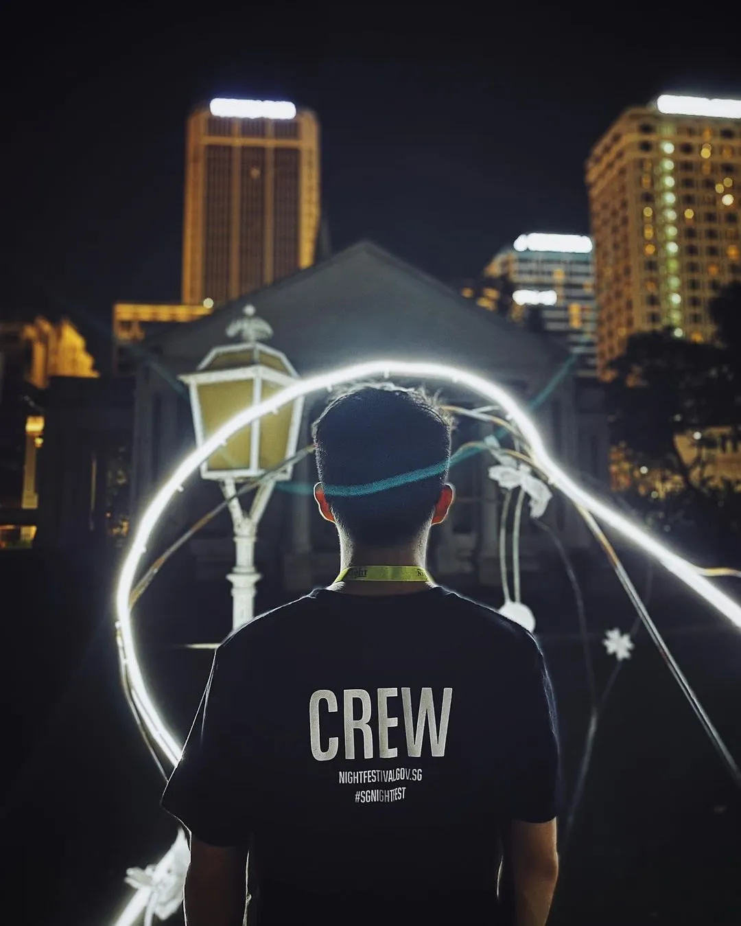
Crew Identity
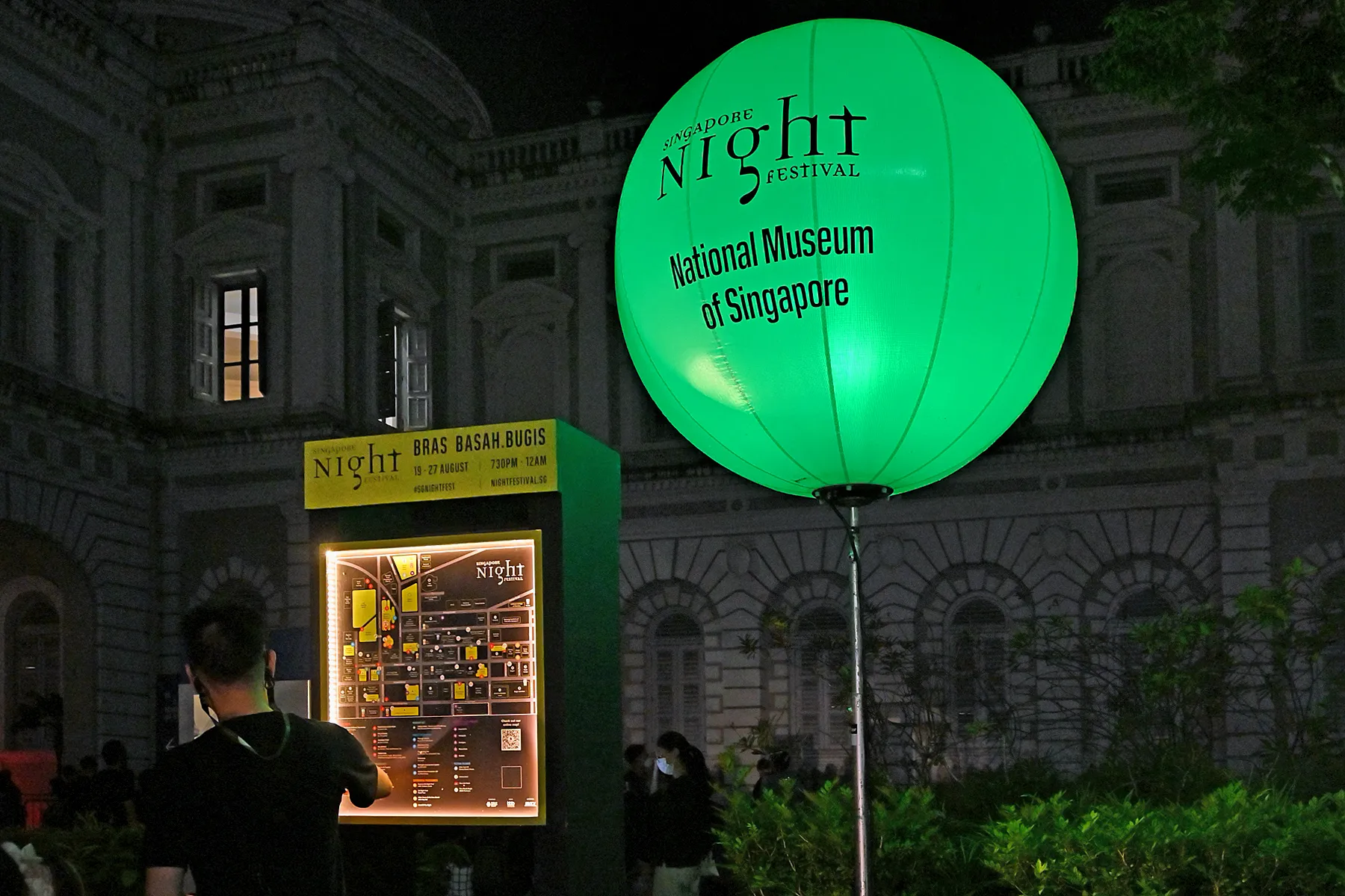
Wayfinding System
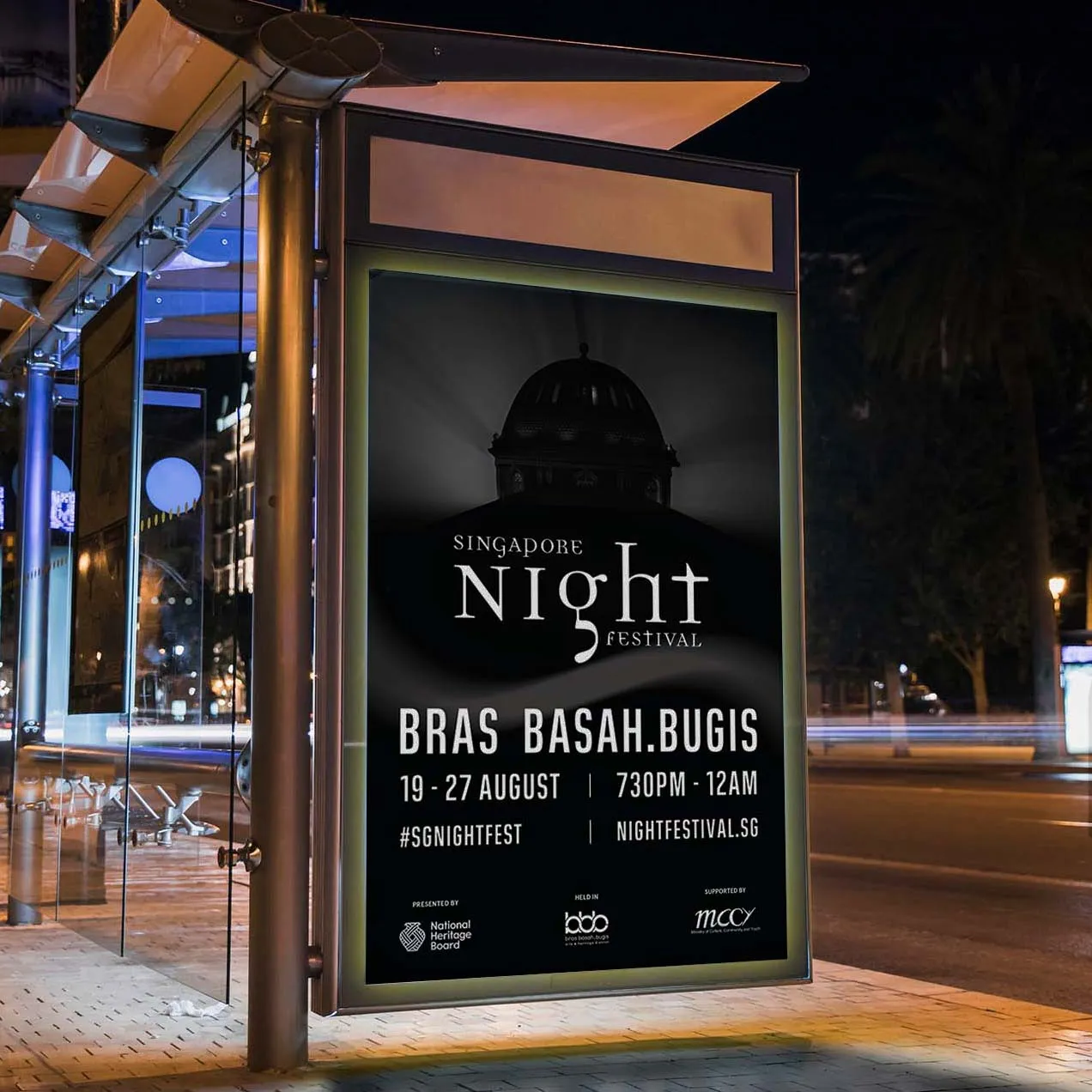
OOH Advertising
"With the SNF visual language set, Cathay Hotel pushed it further, into an immersive mystery with its own key visual."
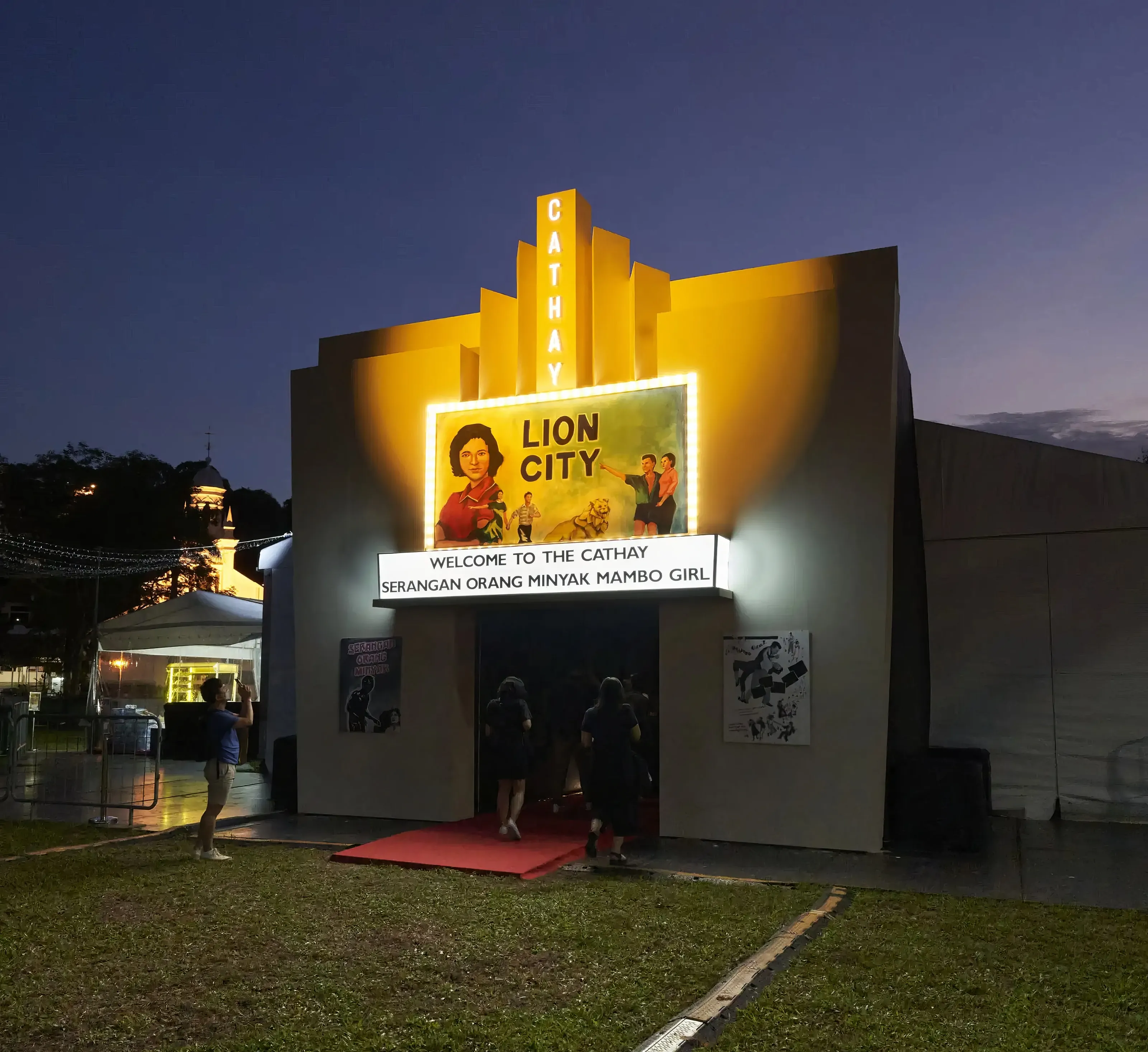
Cathay Hotel Visual Marketing
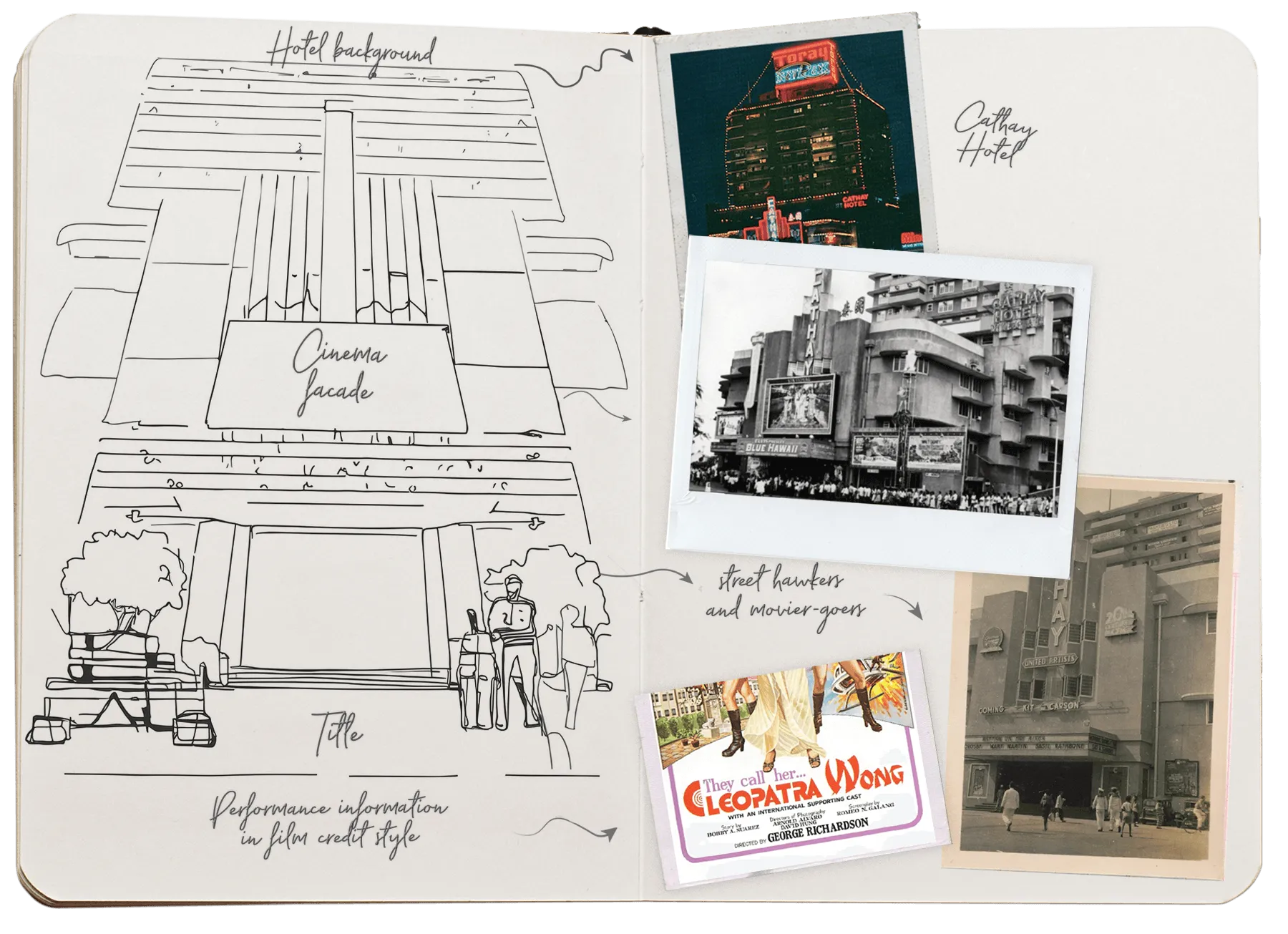
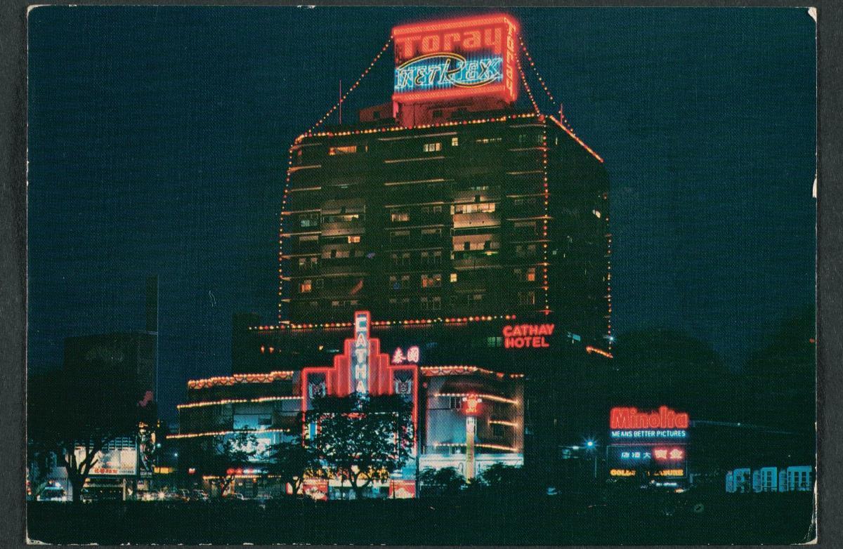
Visual Study
Illustration explorations grounded in classic cinema posters, Cathay’s heritage and archival local film ephemera. Key motifs (type, framing and light) were refined into a modern visual language for the Cathay Hotel key visual.
Process
.webp)