
.jpg)
.jpg)
.jpg)
.jpg)
.jpg)
.jpg)
.jpg)
.jpg)
.jpg)
Gym Tonic's Kiosk
"Designing an elderly-friendly workout interface that stays clear, supportive and easy to follow."
GymTonic supports seniors’ workouts using visual recognition, helping them follow posture guidance while trainers oversee more users safely.
The kiosk requires an intuitive flow and screen design so seniors can complete sessions independently, with clear trainer controls when support is needed.

Understanding the objective
The design process focused on reducing risk early: align stakeholders on who we are designing for, define accessibility guardrails, then iterate through wireflows, usability checks and a high-fidelity prototype to validate the experience before build.
Discovery session
Designing for older generations of consumers, who may not be as comfortable or familiar with technology, requires us to be empathetic to their behaviour and ensure a highly intuitive experience.
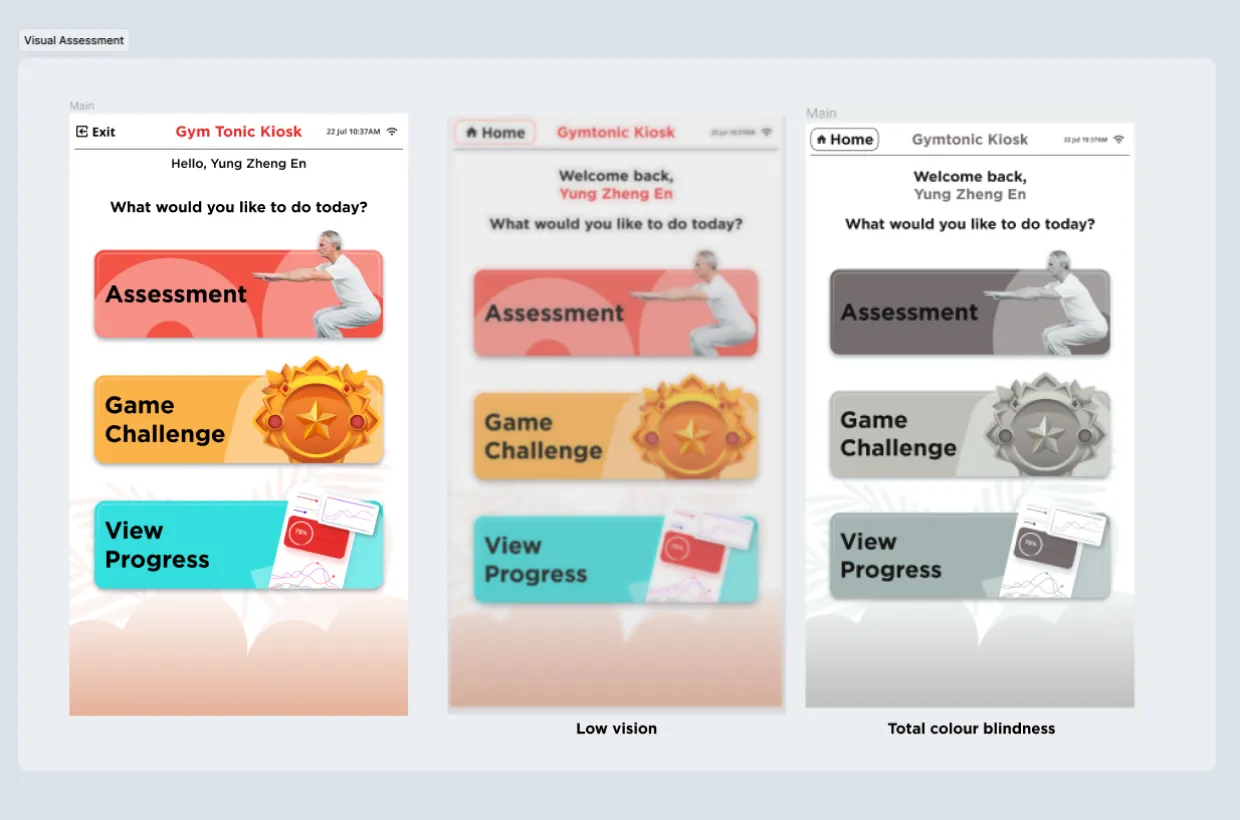
The session aligned with stakeholders on seniors’ needs and set 3 key guardrails:
Optimised visual for impaired senses
Large type, high contrast, low visual noise
Low barrier of entry for the non-tech savy
One clear action per screen, plain language and strong cues. Language localisation is also considered at this point
Provide clear and large instructions to reduce guess work
Instead having the elderly to rely on reading instruction to follow through, we should guide them toward each next steps, through other intuitive ways too.
Wireflow
Mapped the end-to-end wireflow with the product manager, including key edge cases (pause, retry and recovery), so the scope and handoff states were clear.
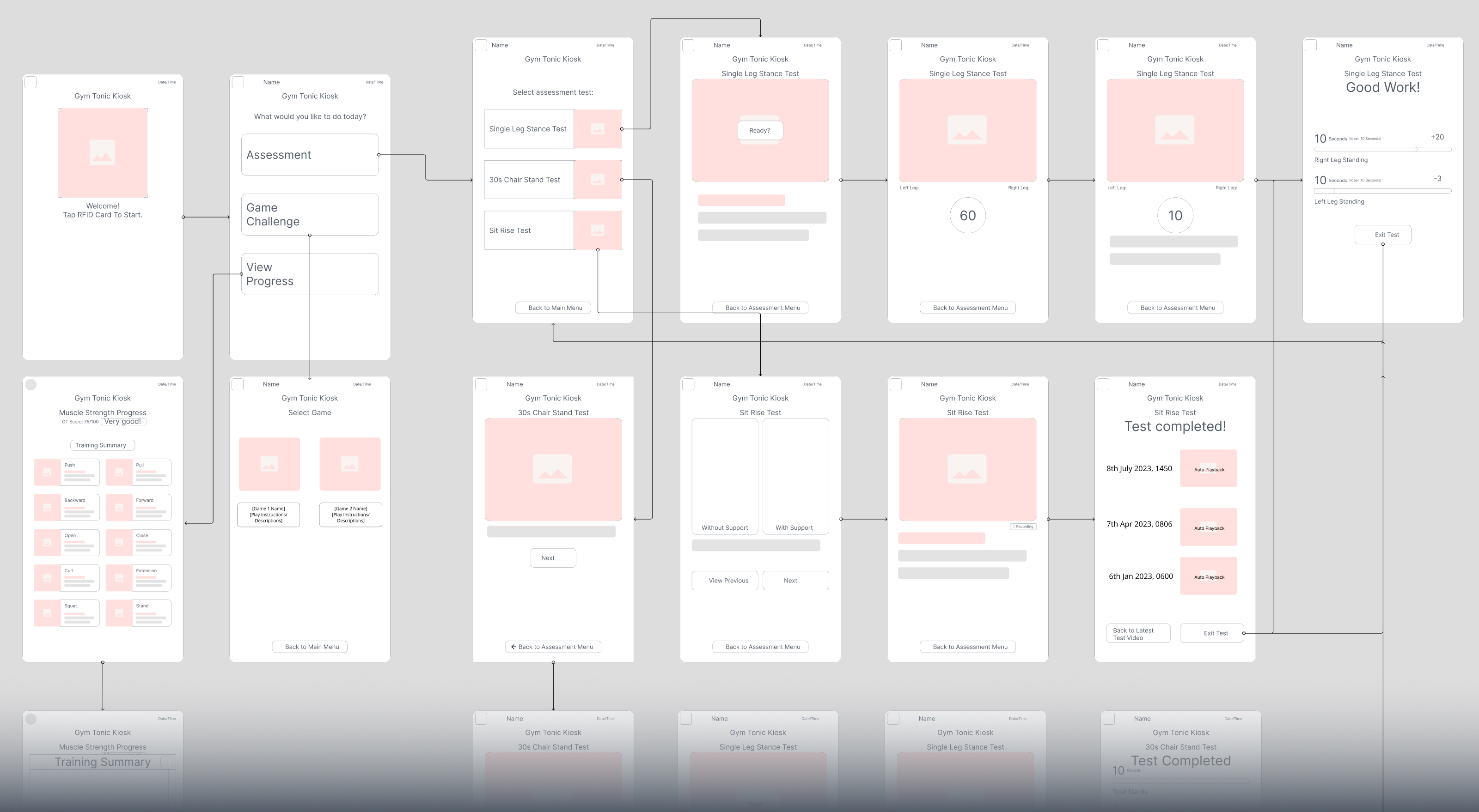
Wireframe + Userflow
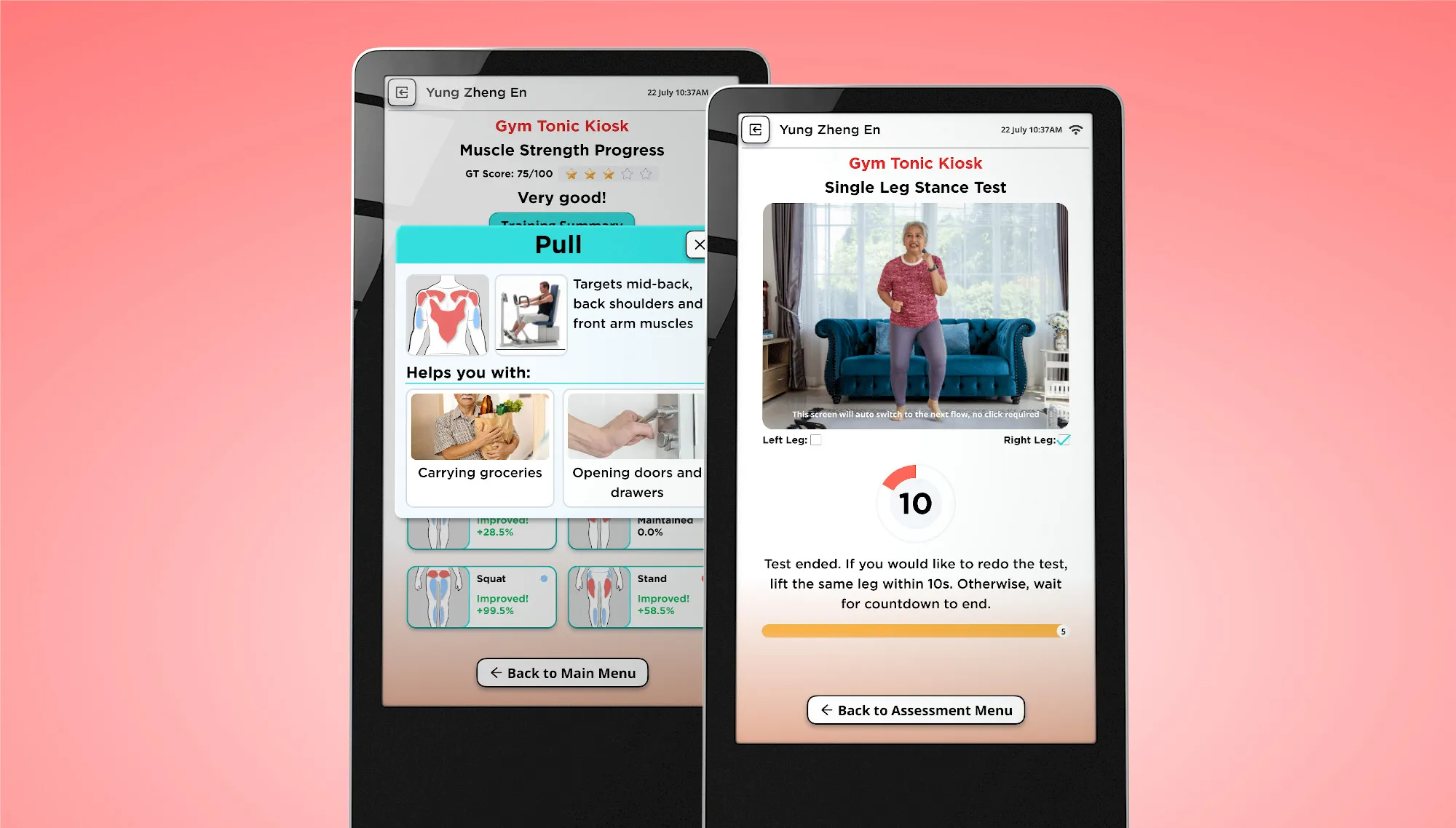
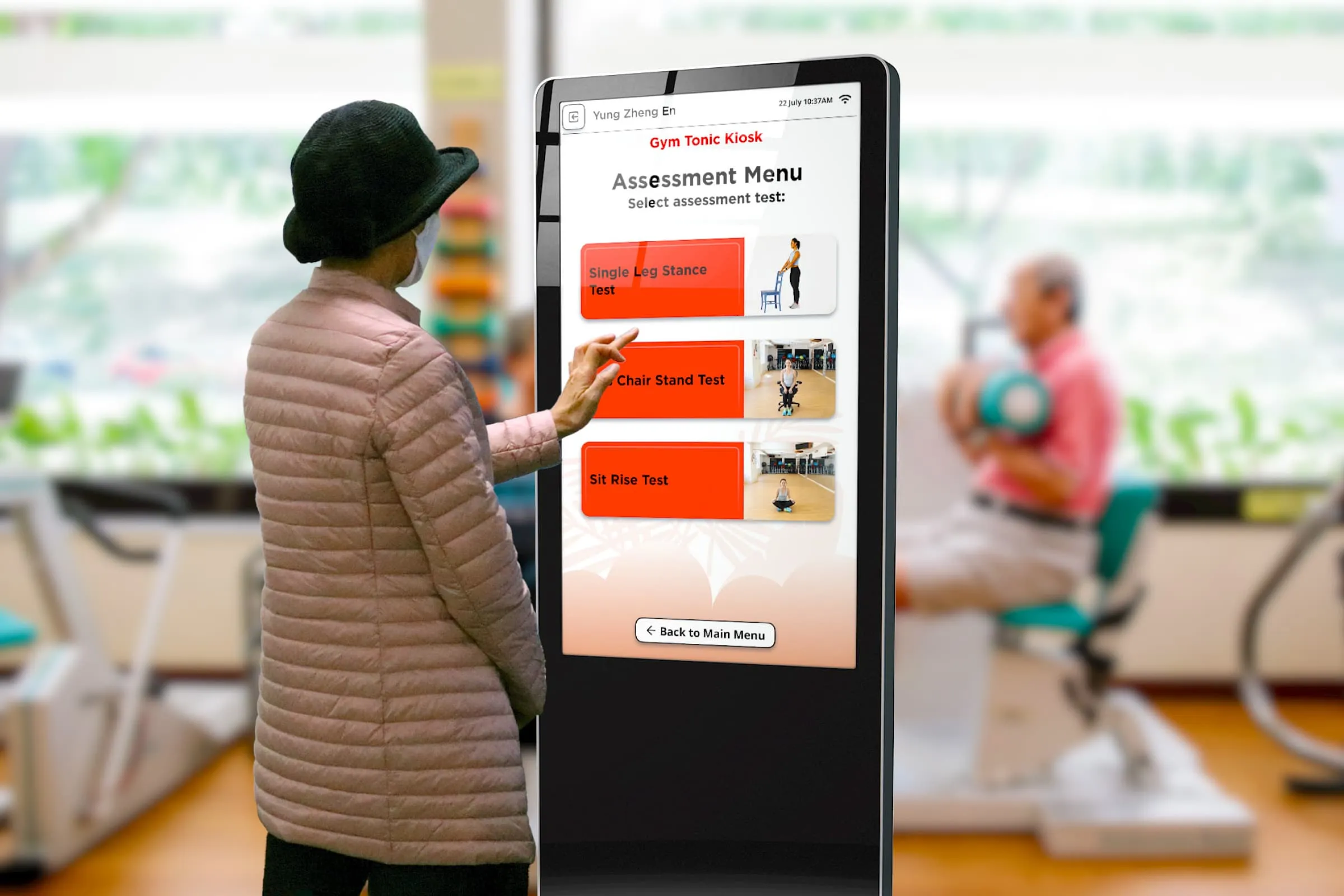
Quick usability checks with seniors
Did quick screen tests to validate readability (at distance), tap targets, contrast and whether the next step was obvious without help, then refined hierarchy and layout density.
Screen test
Outcome
Figma protoype
