IngotPCC
Redesigning healthcare dashboard
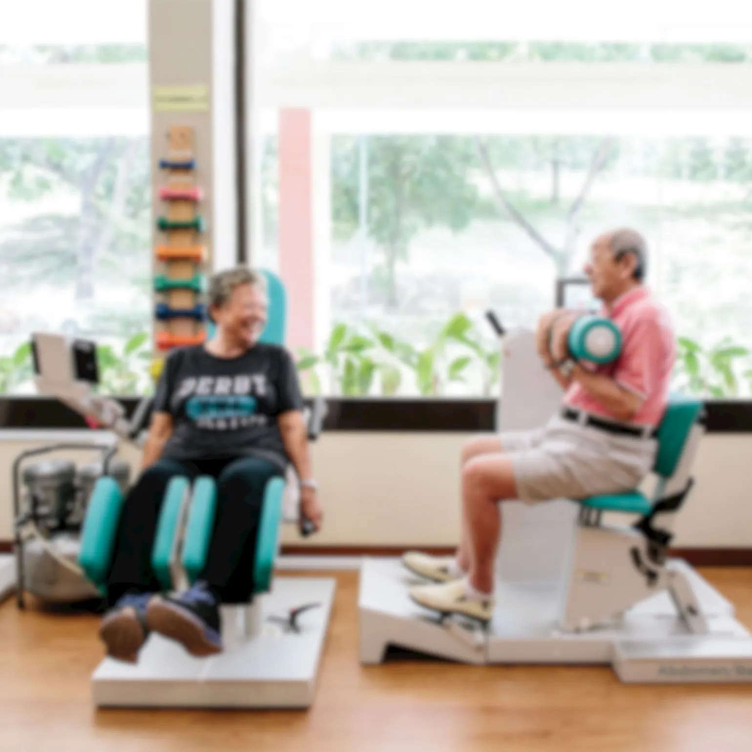
Ingot PCC, a care management product under PulseSync, underwent a transformation from person-centred care to active ageing to align with Singapore's new elderly policy.
My role at PulseSync involved reviewing the existing design system and proposing a redesign approach to make the experience more approachable while addressing existing pain points. I was also responsible for developing user flows and layouts for module add-ons, including a mobile counterpart to facilitate remote consultations and feature upgrades.
Client
Pulsesync
Year
2021–2022
Scope
Design System
Visual Design
Prototyping
UI Audit
Design Process
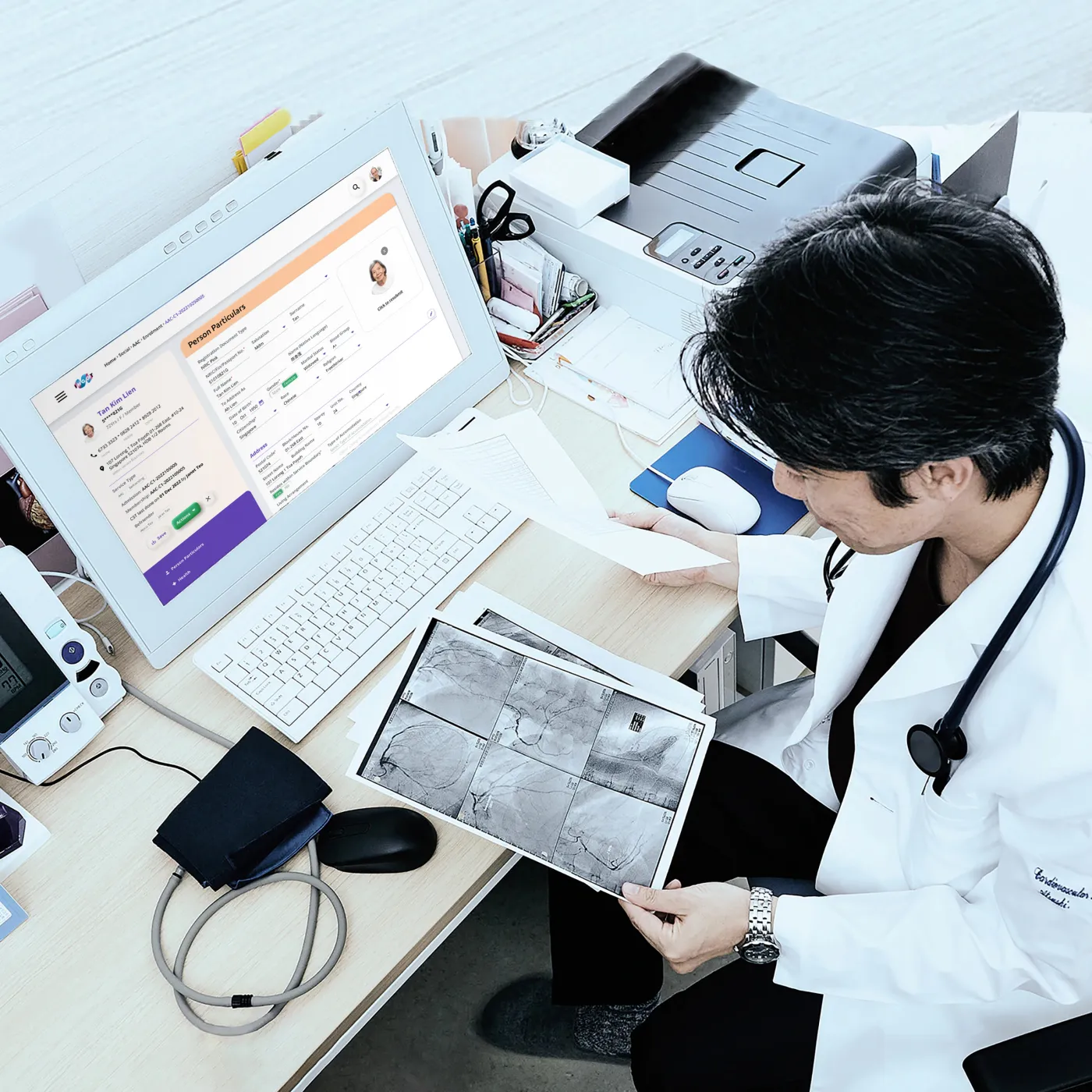
I worked with a team of product managers, developers and medical practitioners to reevaluate IngotPCC to fix bugs, improve the experience, and add new features.
Onboarding
Stakeholders onboarding
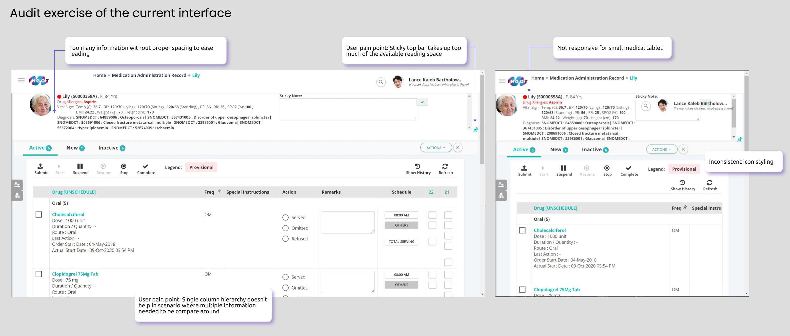
Audit of existing interface
Research
Moodboarding
User feedback
User journey mapping
Design
Design system
Hi-fidelity prototyping
This led us to formulate the problem statement to align the main objective of IngotPCC's redesign:
Managing clinical information can become overwhelming. Medical staff need an efficient way to access and interpret data to reduce visual clutter, alleviate stress during extended shifts, and focus attention on patient care.
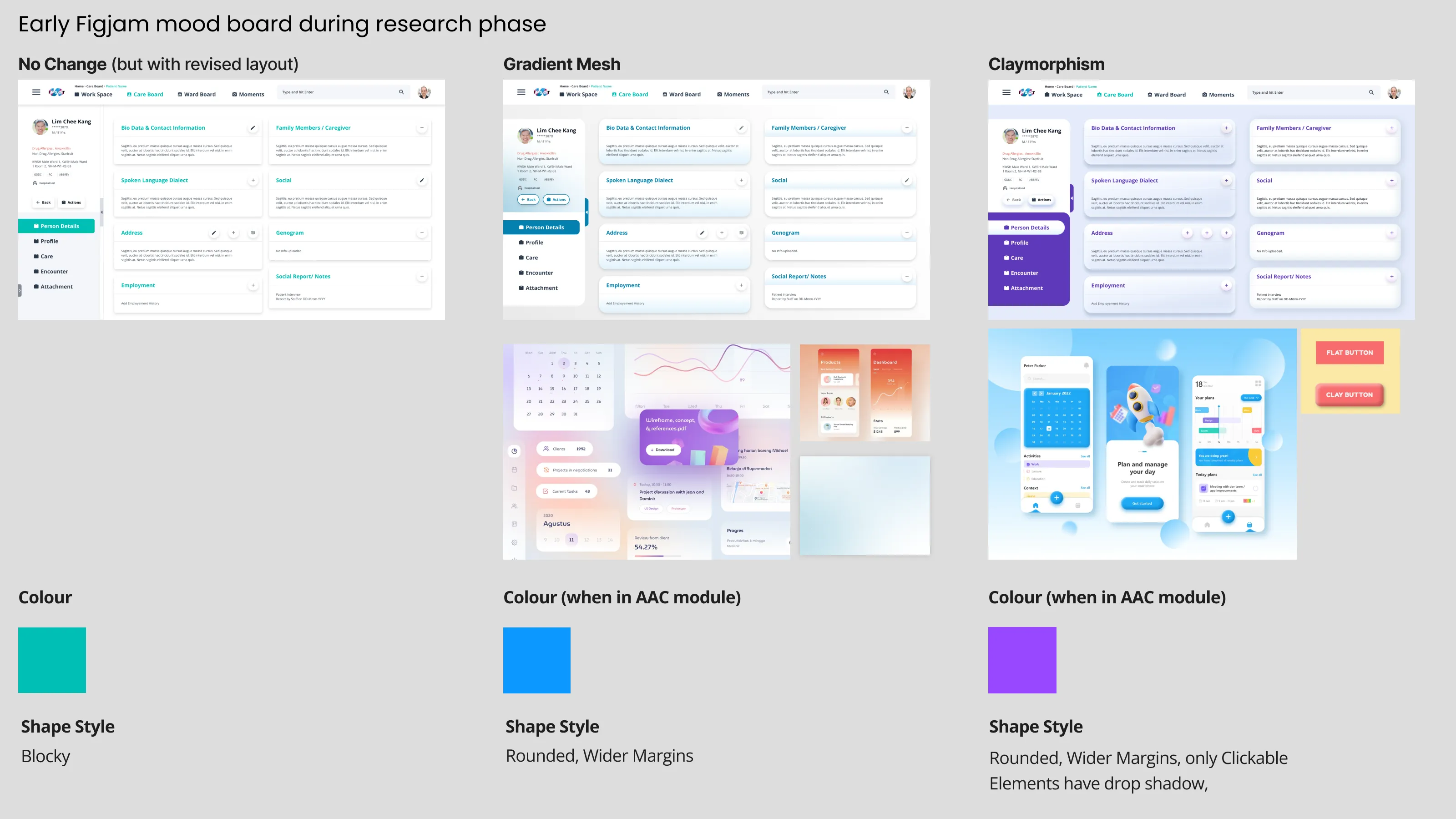
Claymorphic elements
Spaced out grid
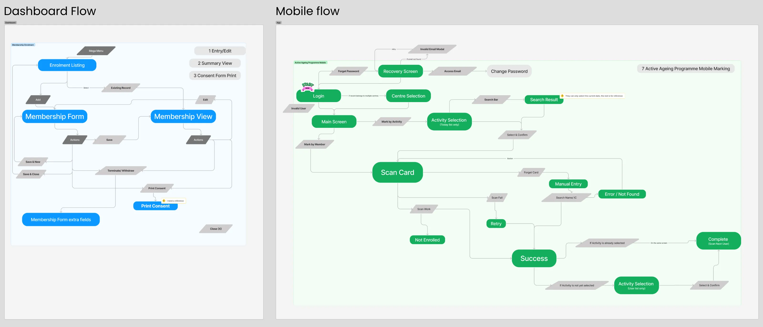
Mapping user flow
In a separate task, I was also involved in mapping the user journey to anticipate their interactions with the new mobile app and dashboard add-on.
Outcome
Design system
With these priority considerations laid out, I proceeded to form the design system before moving into the redesign. The aim was to improve design consistency across the product while creating a brand that felt fun and approachable, yet professional and trustworthy.
Component system in Figma using the atomic design approach
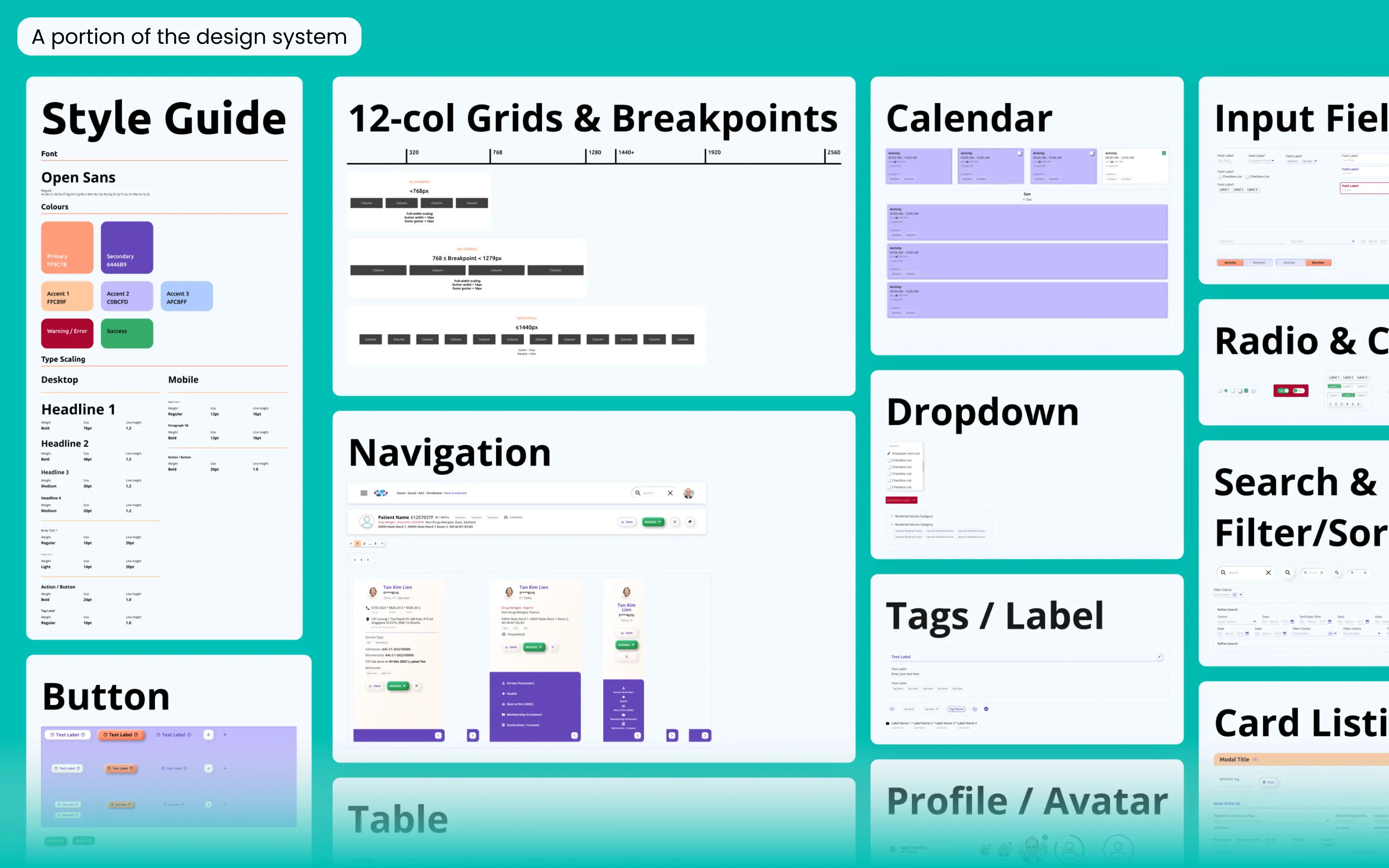
Icon component system
Icon Styling
To ensure the icons of different shapes and weights adhere to a consistent ratio and maintain clarity even at small sizes, I used an icon grid and ensured that all icons are drawn uniformly in the round glyph style.
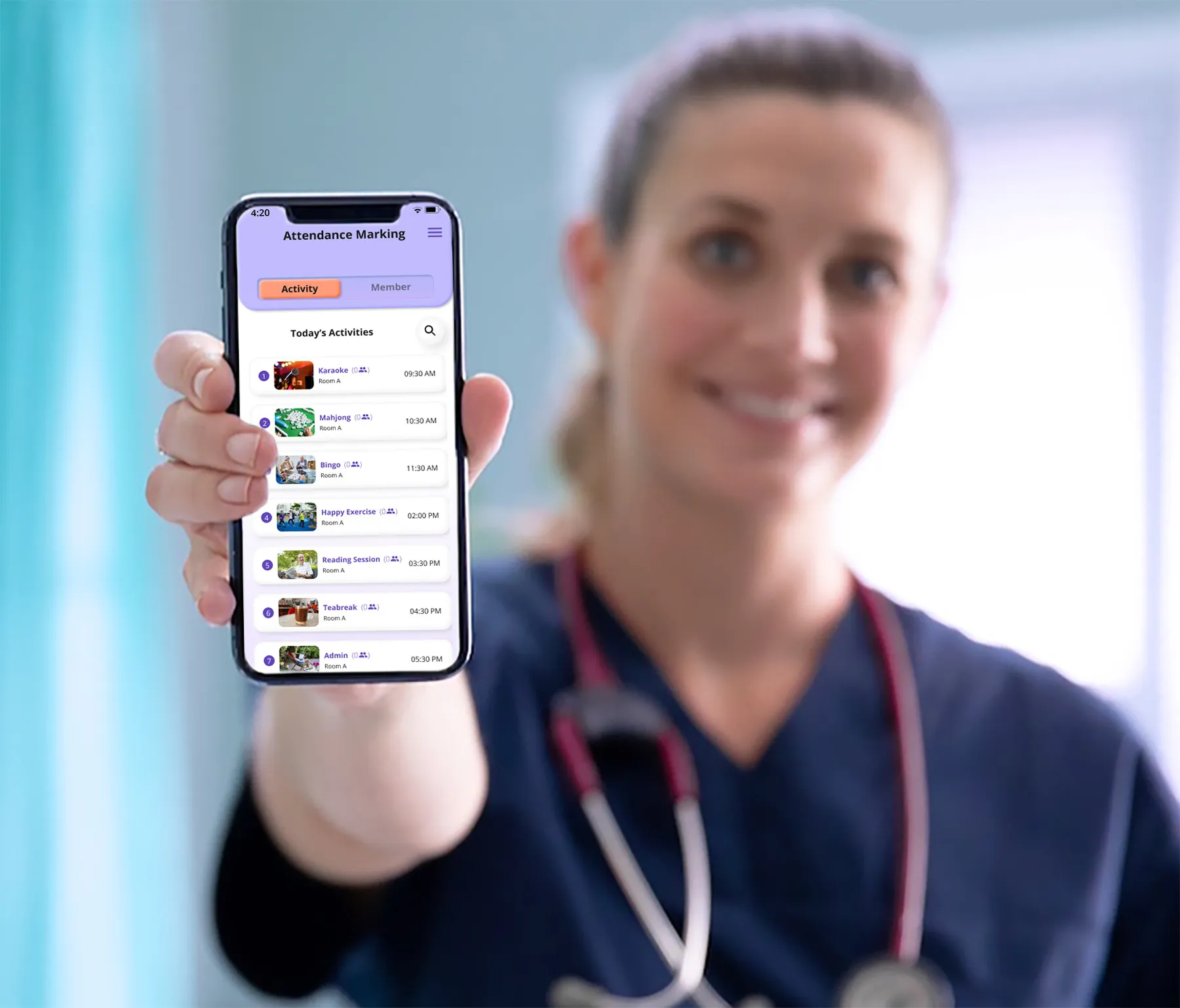
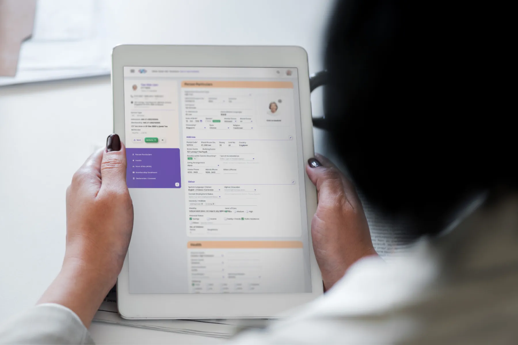
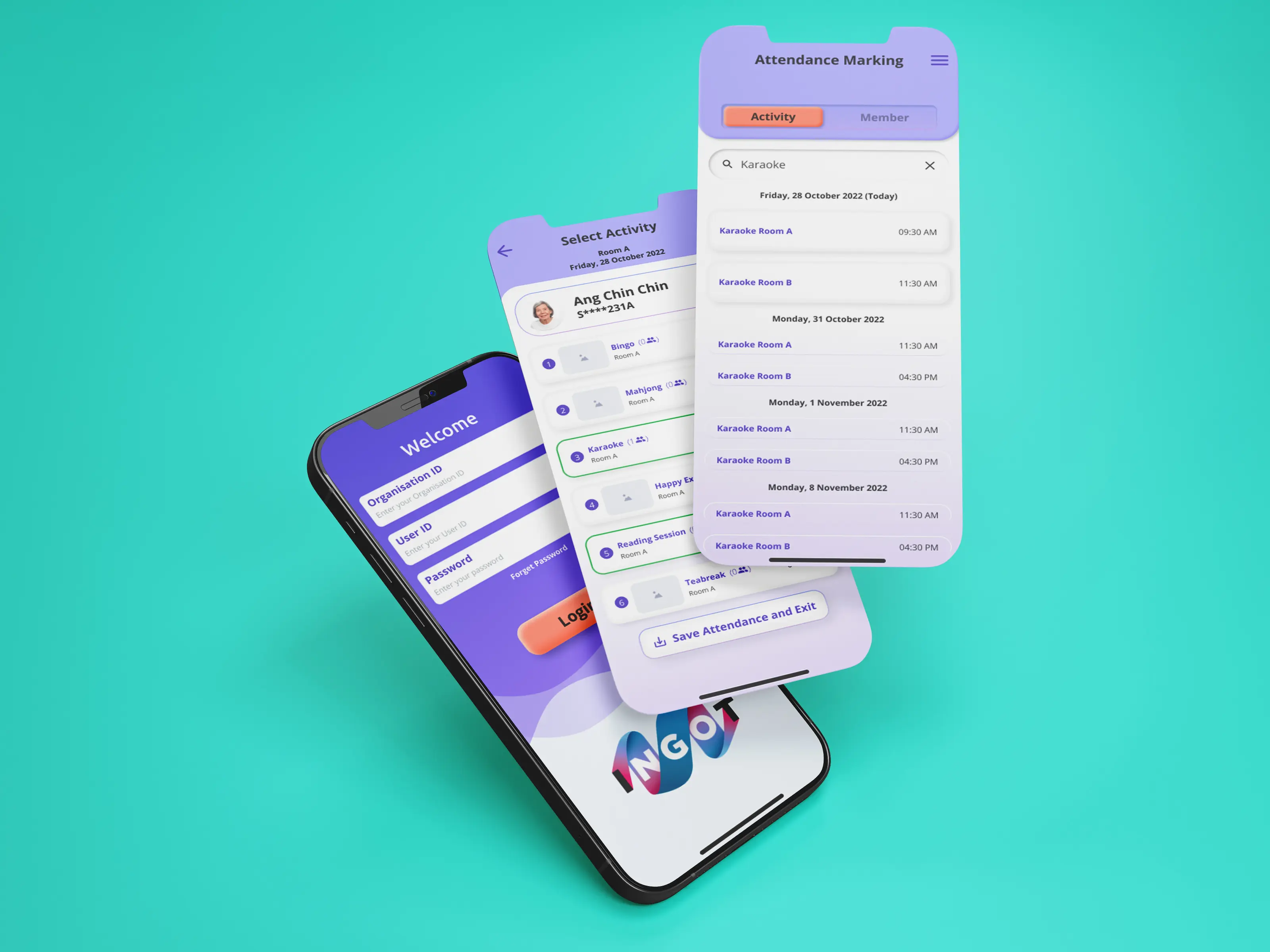
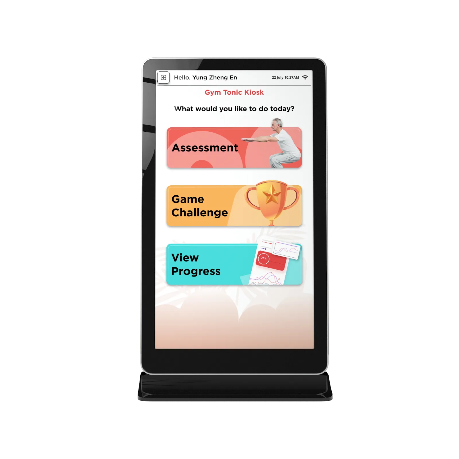
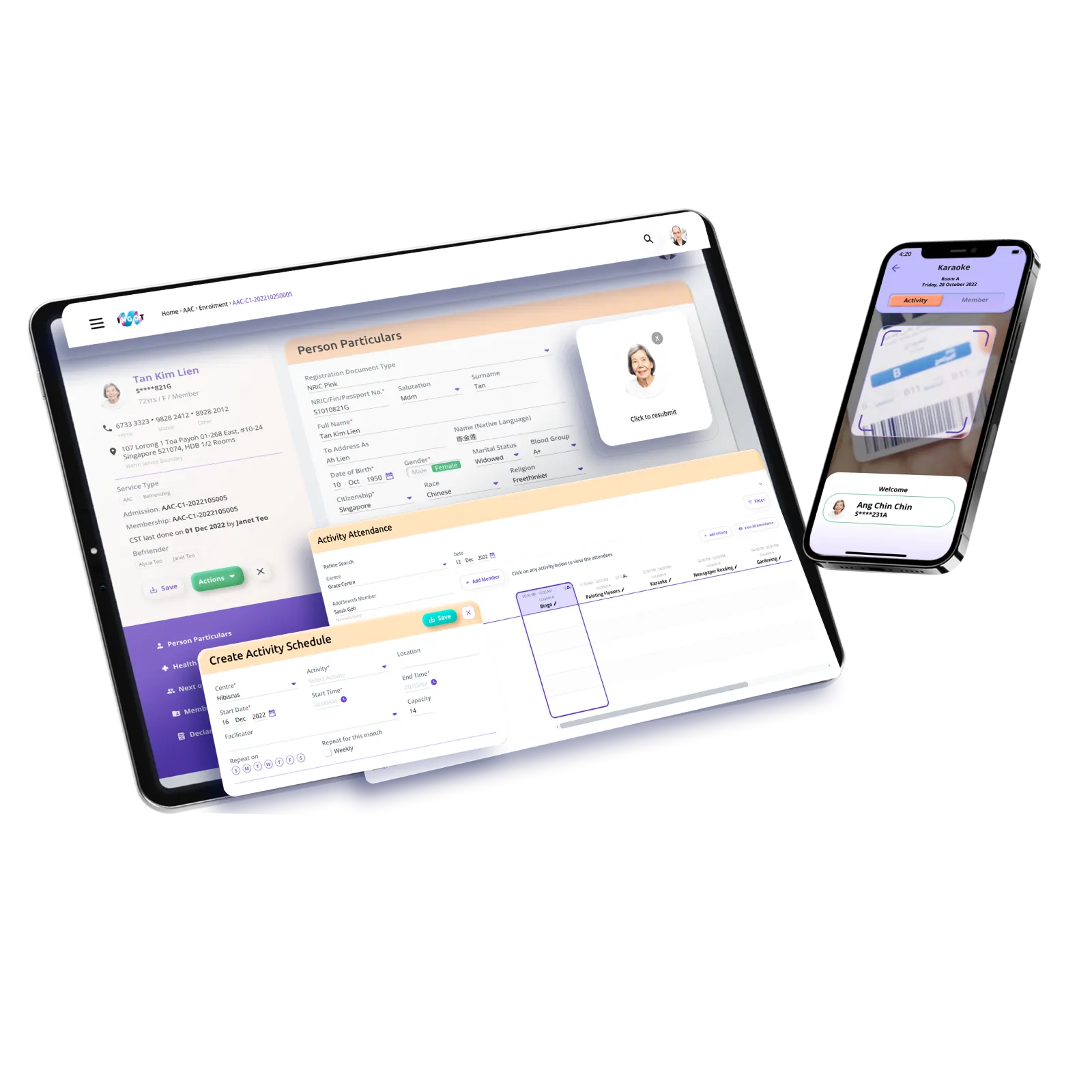
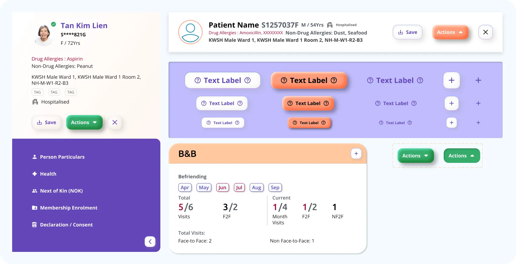
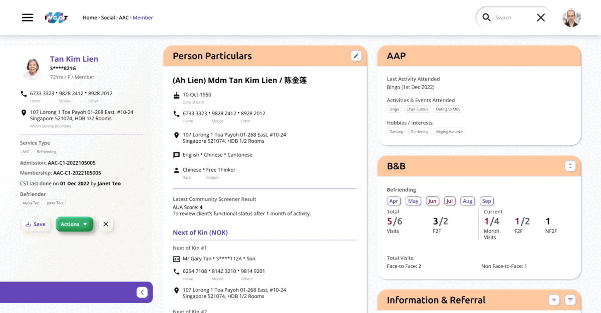
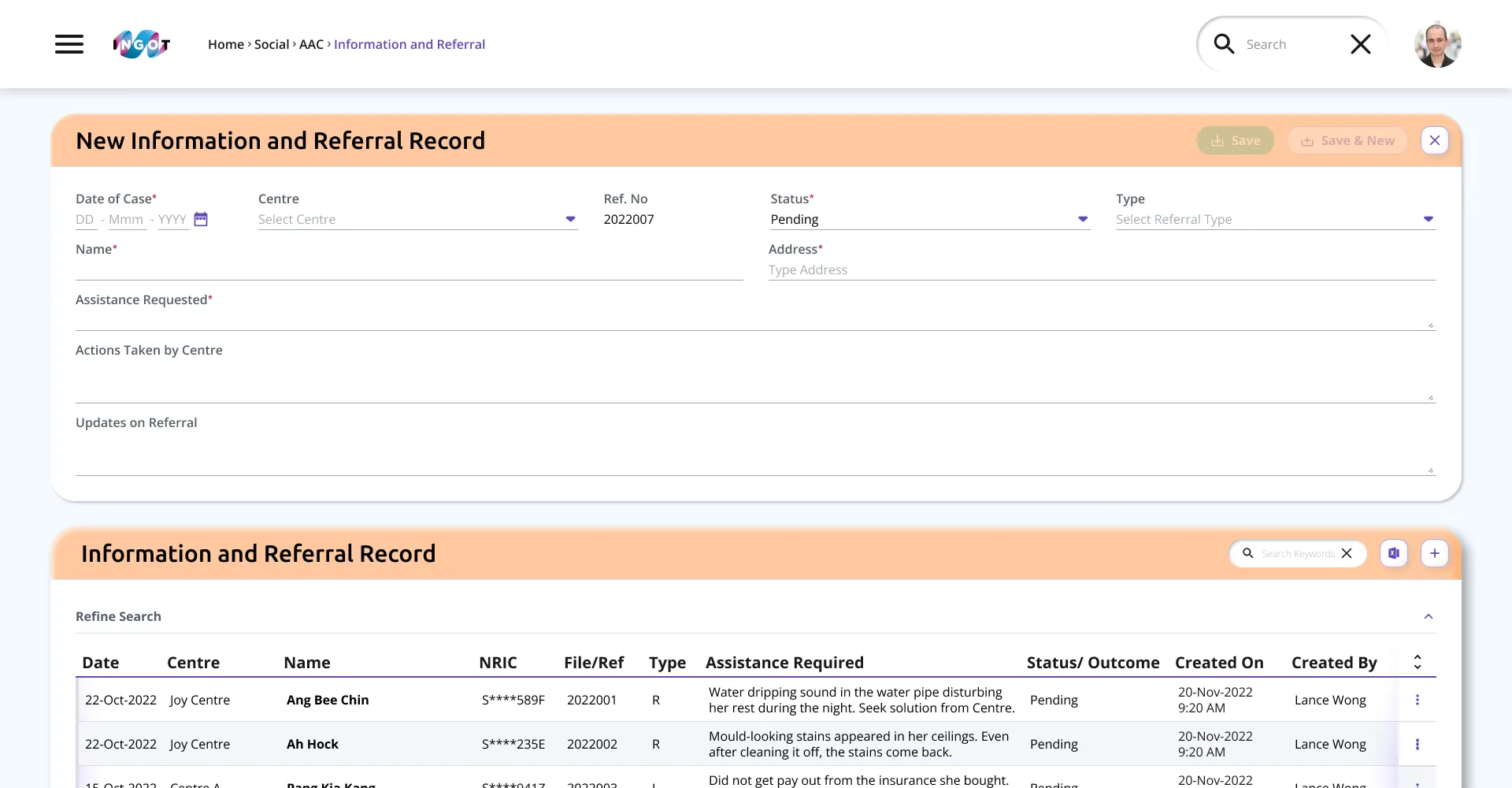
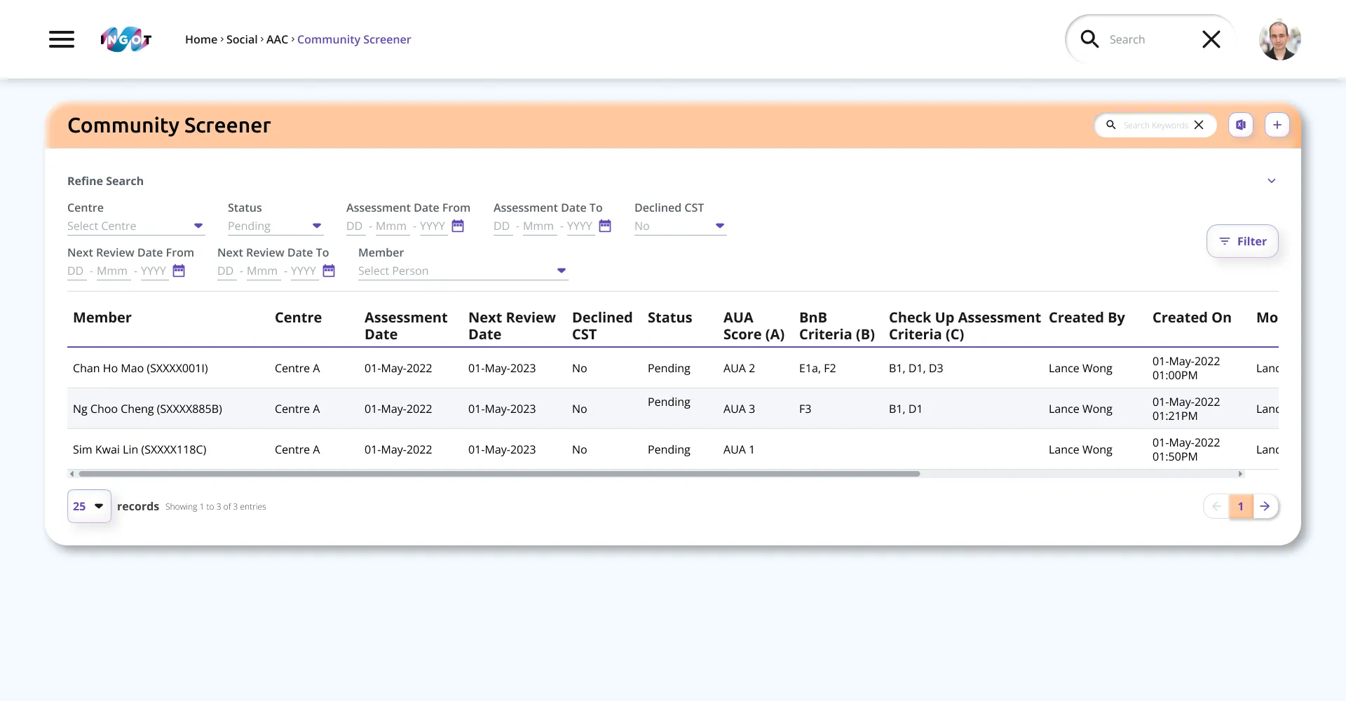
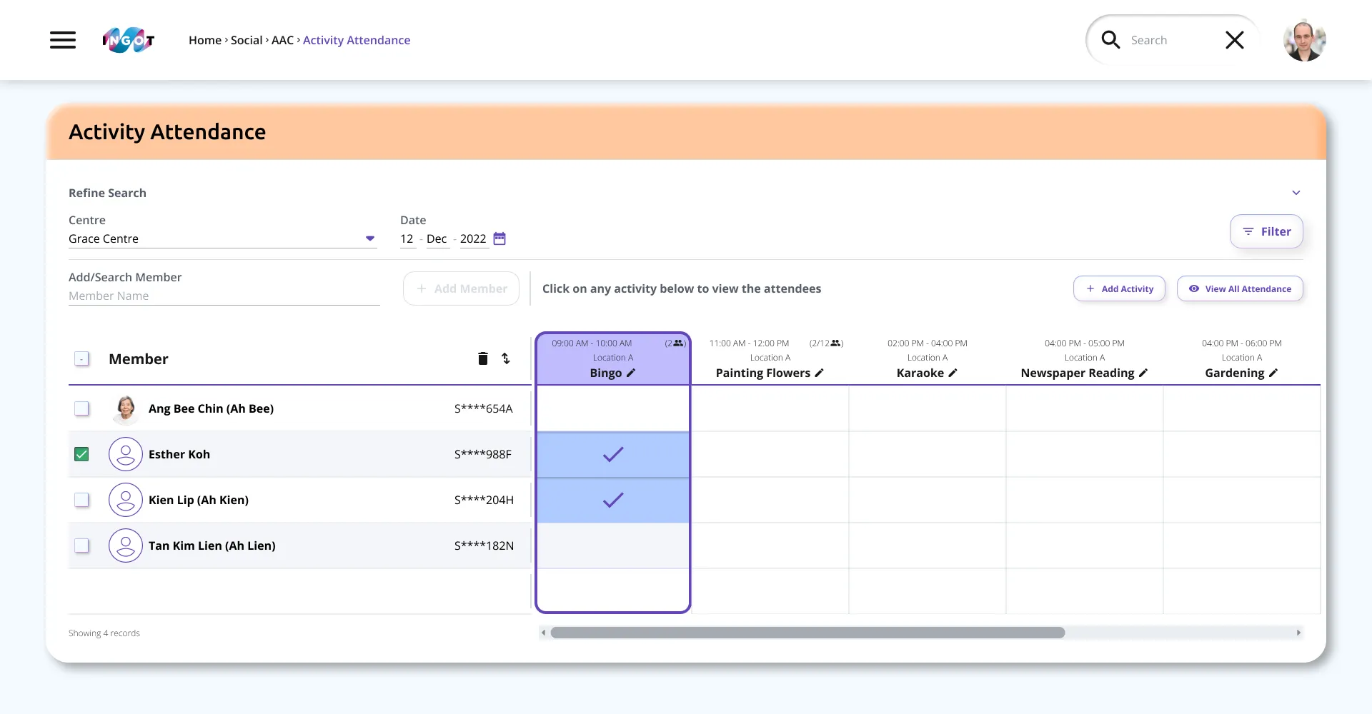
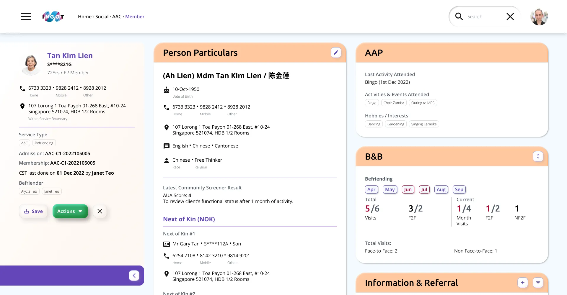
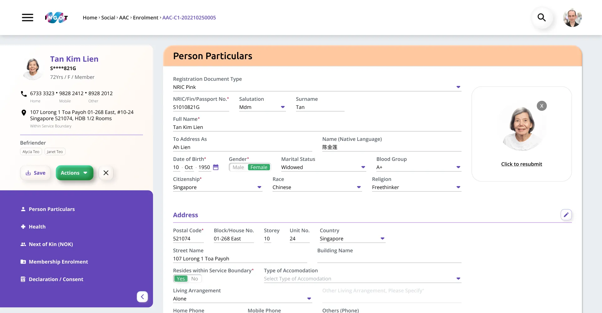
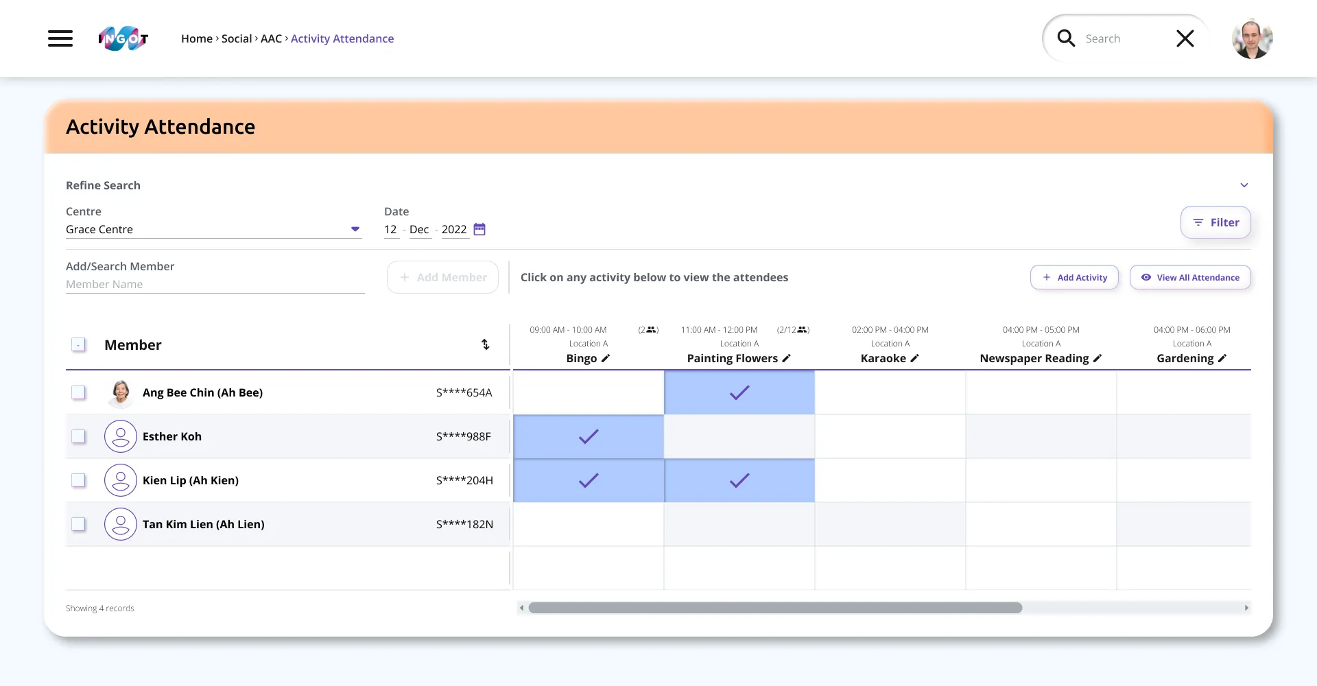
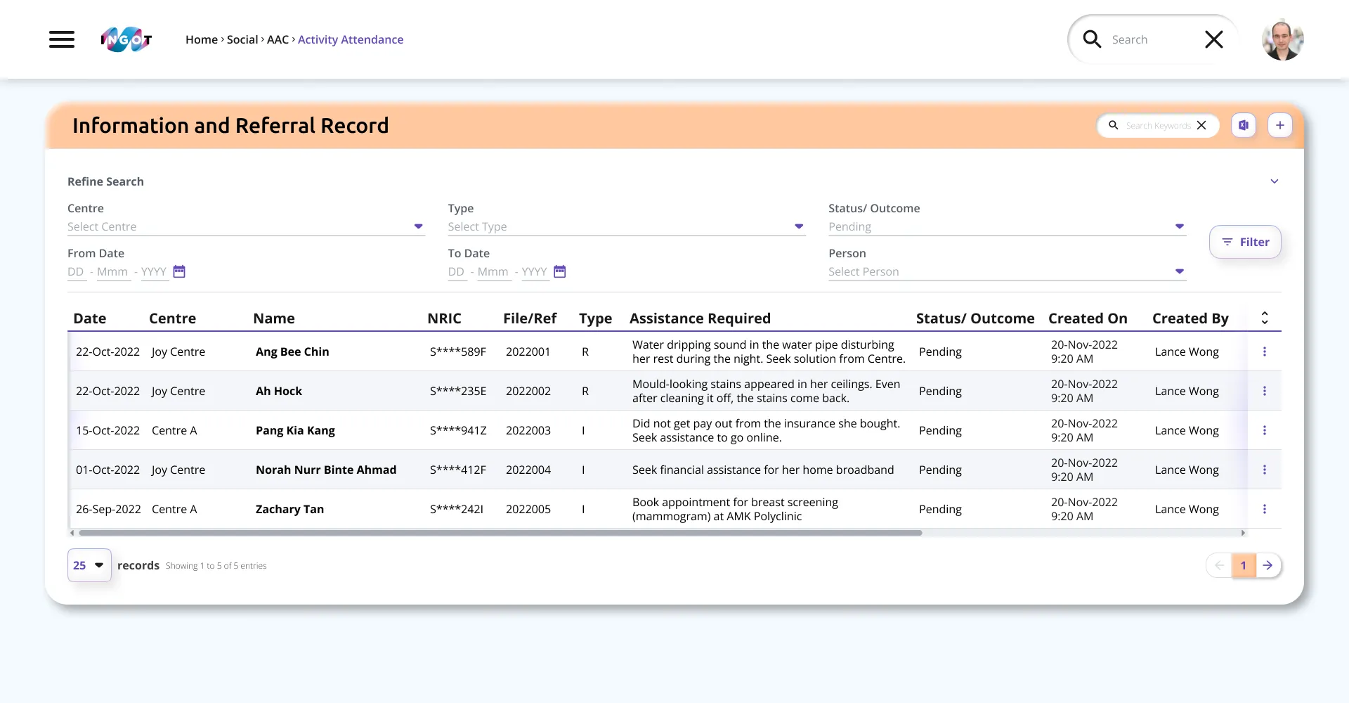
Dashboard Prototype
These are the final designs of the various screens, created after user prototyping sessions, before being sent for development.
ⓘ Remaining content and the mobile app are confidential. For a prototype preview or further information, please contact K.B.